
UI/UX Design Malta: We Helped Boost Online Sales by 25%, A Real-World Example
We often hear that “design matters,” but in business, it’s sometimes hard to prove. What if a single website redesign could grow your sales by 25% — without increasing traffic or ad spend?
That’s exactly what happened to one Maltese company we worked with. Through thoughtful UI/UX design, clear user flows, and better mobile experience, their online store went from “good enough” to a conversion-driven sales machine.
In this article, we’ll break down how UI/UX design transforms business results, why it’s crucial for Maltese companies today, and what lessons you can apply to your own website or app.
What Is UI/UX Design (and Why It’s Crucial for Sales)?
Before diving into the case, let’s clarify the basics:
Before diving into the case, let’s clarify the basics:
UI (User Interface) is what your visitors see and interact with — layout, colors, buttons, typography.
UX (User Experience) is how it feels to use your site — how easily users can find, understand, and buy what they want.
In today’s digital economy, good design isn’t about decoration — it’s about decision-making. Every friction point, confusing label, or misplaced button costs you potential revenue.
For companies in Malta competing both locally and across Europe, UI/UX design is one of the most effective, low-cost ways to improve performance without buying more traffic.
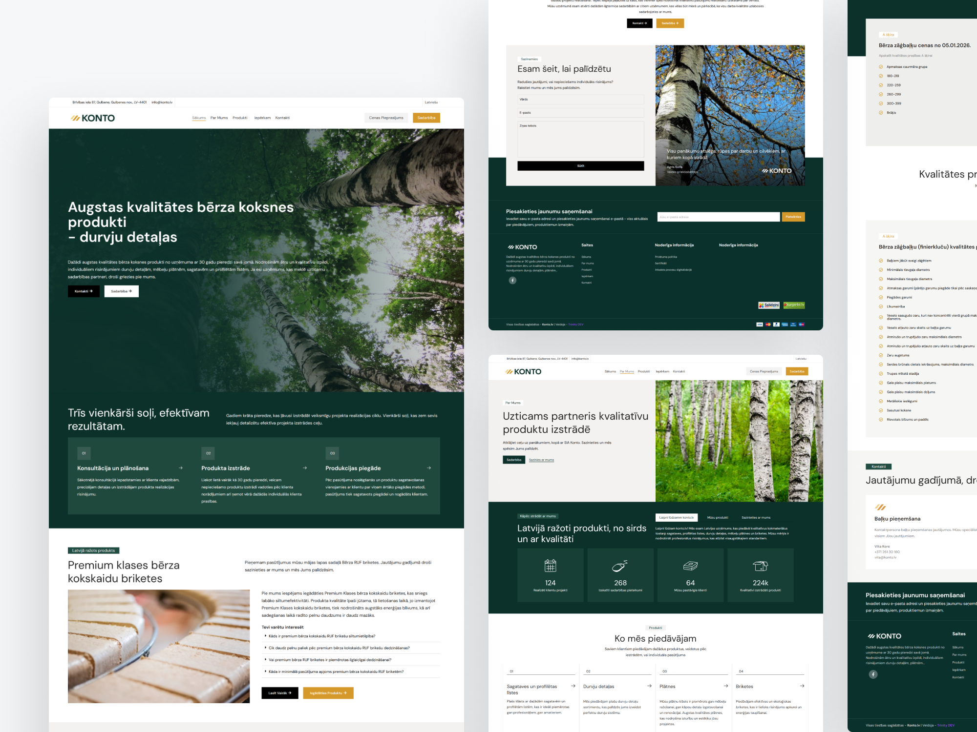
Case Study: How a Retailer Increased Sales by 25% After a Redesign
Let’s look at a real example.
BlueWave Home, a mid-sized Maltese retailer of home and lifestyle products, had a Shopify-based e-commerce site. They were getting steady traffic from Google Ads and Facebook campaigns — around 10,000 monthly visitors — but sales had plateaued.
Despite good products and fair prices, conversions hovered around 1.8%, well below industry benchmarks.
Step 1: UX Audit and User Behavior Analysis
We started by performing a full UX audit:
Recorded session replays and heatmaps
Interviewed a few real customers
Checked analytics for drop-off points
What we found:
40% of visitors dropped off on mobile product pages
Navigation was cluttered with too many categories
Add-to-cart buttons were inconsistent and sometimes below the fold
Checkout process had 4 steps and required account creation
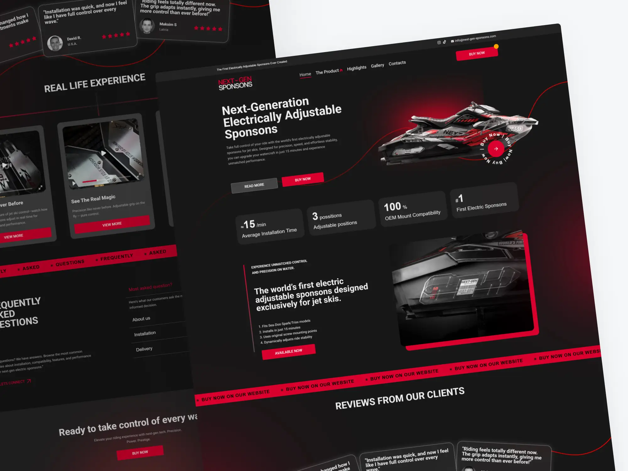
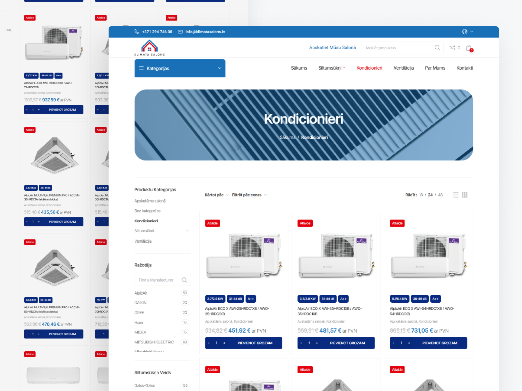
Step 2: Simplifying the Design (UI Refresh)
We rebuilt the interface using modern UI/UX design principles:
Unified color scheme with high-contrast CTAs
Consistent spacing and clean typography (Inter + soft gray backgrounds)
Simplified menu with 5 clear categories
Highlighted free shipping and trust badges
Step 3: Improving the User Experience
We then optimized UX flows:
Reduced checkout steps from 4 to 2
Added guest checkout and autofill support
Introduced personalized “You might also like” recommendations
Finally, we tested everything with real users — friends, colleagues, and even existing customers — to see how they navigated the new site.
The Results: +25% in Sales, +32% in Mobile Conversions
Within the first month after launch, BlueWave Home saw:
25% increase in total sales
32% increase in mobile conversions
17% decrease in cart abandonment
Lower bounce rate (especially on product pages)
They didn’t increase ad spend or change their products. The only change was design — which made the buying process easier and more trustworthy.
Customers even commented things like:
“It finally feels like a modern shop — I can find things faster.”
“Checkout was so much easier this time!”
Simplified menu with 5 clear categories
Highlighted free shipping and trust badges
Why This Works: The Psychology Behind Great UX
Behind every successful redesign lies a few core principles of human psychology and UX strategy:
1. Cognitive ease: When your brain doesn’t have to work hard to understand something, you trust it more.
2. Visual hierarchy: Users look where design leads them — clear CTAs and white space guide the eye.
3. Micro-interactions: Small animations (like a button ripple or progress bar) reassure users that something’s happening.
4. Social proof and trust: Subtle design cues (reviews, badges, icons) reduce hesitation.
Good UI/UX design doesn’t force people to buy — it simply removes the barriers that were stopping them.
UI/UX Design in Malta: Local Trends and Insights
Malta’s digital landscape is evolving rapidly. From online retail to fintech and tourism, businesses are realizing that design is a growth lever — not just a cost.
Some of the strongest trends we’re seeing locally include:
Mobile-first interfaces (60–70% of traffic now comes from mobile)
Bilingual UX for English and Maltese audiences
Minimalist, conversion-focused layouts
Integration with automation tools (like Komprendo or Tilde systems)
Brand consistency across website, app, and social channels
Local companies that invest in UI/UX design Malta are not just keeping up — they’re gaining a measurable edge over competitors who still rely on outdated templates.
How to Tell If Your Website Needs a UX Redesign
If any of these sound familiar, it’s time to look closer:
You’re getting traffic but few conversions
Visitors drop off before checkout
Your website looks outdated or inconsistent on mobile
Users often ask basic questions your site should answer
Your analytics show high bounce rates
UI/UX design isn’t about making things “prettier” — it’s about aligning your digital experience with how real people think, behave, and buy.
Practical Takeaways
If you want similar results, start here:
1. Audit your site — use tools like Hotjar or GA4 to see where users struggle.
2. Simplify your layout — fewer elements = less confusion.
3. Optimize mobile first — test your checkout on real devices.
4. Highlight trust — include payment security, guarantees, reviews.
5. Measure, iterate, and test — small changes can have big impact.
Good UI/UX design doesn’t force people to buy — it simply removes the barriers that were stopping them.
This agile approach ensures you create not just a “beautiful” app — but one that performs.
Conclusion
The BlueWave Home example proves that investing in UI/UX design can directly translate into higher revenue — not just a better look.
For Maltese businesses, it’s no longer optional; it’s a key growth strategy. Whether you’re an eCommerce retailer, startup, or service provider, the difference between a visitor and a customer often comes down to one thing: experience.
On this page
- 1. Introduction: UI/UX Design Malta: We Helped Boost Online Sales by 25%, A Real-World Example
- 2. What Is UI/UX Design (and Why It’s Crucial for Sales)?
- 3. Case Study: How a Retailer Increased Sales by 25% After a Redesign
- 4. The Results: +25% in Sales, +32% in Mobile Conversions
- 5. Why This Works: The Psychology Behind Great UX
- 6. UI/UX Design in Malta: Local Trends and Insights
- 7. How to Tell If Your Website Needs a UX Redesign
- 8. Practical Takeaways
- 9. Conclusion
Take a step forward
Let’s explore together how we can help to take your game to the next level— book a meeting with our expert team today!
Design, Develop, Deliver.
Are you ready to start?
All starts with a single conversation, so let's start the journey now. Book a free call with our expert, and we will help you decide which next steps would be the best for you
Fill out the application form and we will contact you as soon as possible to arrange a consultation time.